

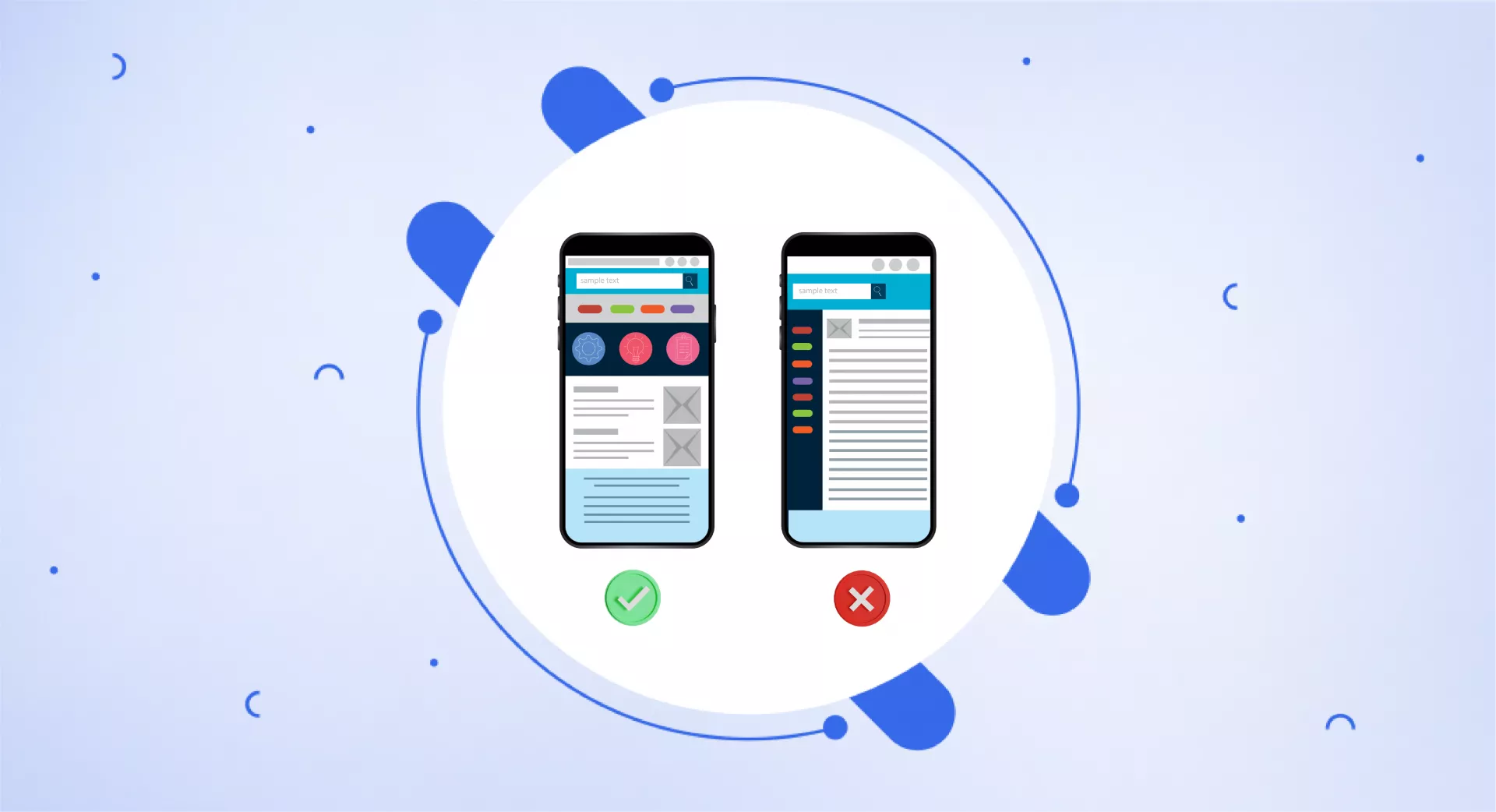
What is mobile-first indexing?
Mobile-first indexing means that search engines like Google primarily use the mobile version of a website, rather than the desktop version, to index pages and rank them in search results.
This is because more and more people are searching on their phones rather than computers. So sites that are optimized for mobile, with fast loading times, readable text, and easy navigation, will perform better in search rankings.
The goal is to serve users on mobile devices by enhancing user experience with improved usability.
Timeline of mobile-first indexing
In 2016, Google first introduced the concept of mobile-first indexing, but did not yet implement it widely.
In March 2018, Google began officially migrating specific websites to be indexed based on their mobile version rather than their desktop version. The migration was conducted gradually over time.
In December 2018, Google announced that starting in July 2019 all newly created websites would automatically utilize mobile-first indexing as the default.
Then in July 2019, mobile-first indexing did indeed become the standard approach for new websites.
In March 2020, Google updated the algorithm it uses to crawl websites (known as "Googlebot") to adopt a smartphone user agent.
This allowed Googlebot to better crawl and index specifically mobile-optimized pages moving forward.
Finally, as of February 2023, mobile-first indexing has become the standard indexing method across the board for Google.
For all websites, Google now primarily references the mobile version of pages when conducting indexing and consequently ranking pages in search results.
The goal of transitioning to mobile-first indexing was to better serve and match the experience of the growing number of users searching on mobile phones rather than computers or desktops.
How does it work?
With mobile-first indexing, Google mainly looks at and evaluates the mobile version of websites when doing this indexing process.
Therefore, if a website has both a mobile version and a desktop version, Google primarily analyzes and ranks the mobile version.
The reason Google cares more about the mobile version now is that most people access the internet on their smartphones.
Therefore, Google wants to put sites in search that work well on phones - easy readability, fast loading speeds, etc.
It means Google's algorithms use the mobile site as the main basis for crawling, assessing relevancy, and ranking site pages in the search results you see.
Google predominantly uses the mobile version of a site's content, crawled with the smartphone agent, for indexing and ranking. This is called mobile-first indexing.
It simply means that there are no two indexings, instead, there will be an indexing with mobile indexing as a priority.
Why is mobile-first indexing important?
These days most people search for things online using their smartphones rather than computers.
Google realized this and wanted to start indexing and ranking websites based on the mobile experience rather than the desktop experience.
Therefore, mobile-first indexing is important because it matches how the majority of people actually browse and search the internet now.
If a website is optimized for mobile devices, with fast loading, easy reading and navigation, etc. then Google will rank it higher in the search results when people search from their phones.
This encourages website owners to focus on making their sites as functional as possible, particularly on mobile devices.
If they do this, they'll attract more mobile search traffic from Google, leading to more business and conversions.
Do you have to shift to mobile-first indexing or does Google do it for you?
Google automatically shifts websites to mobile-first indexing when it deems them ready. Website owners do not need to manually request or initiate the shift to mobile-first indexing. Google elaborates it this way
Mobile-first indexing is enabled by default for all new websites (new to the web or previously unknown to Google Search). For older or existing websites, we continue to monitor and evaluate pages based on the best practices detailed in this guide. We inform site owners in the Search Console of the date when their site was switched to mobile-first indexing.
How to check mobile-first indexing?
You can check if your website has been switched to mobile-first indexing using Google Search Console.
Here's how:
Go to Google Search Console and select your website.
Click on the "Settings" icon in the bottom left-hand corner of the screen.
Under the "Settings" section, click on "Site settings”.
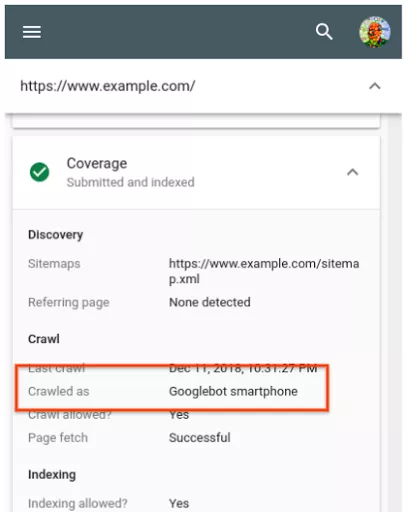
Look for the "Googlebot Smartphone" section. If it says "Enabled", then your website has been switched to mobile-first indexing. If it says "Disabled," then your website is still being indexed based on its desktop version.
Moreover, Google Search Central suggests checking the “URL Inspection Tool” option where you can check if your page is in has “Googlebot smartphone” next to “Crawled as”
How to create mobile-friendly sites?
Use responsive design
Responsive design means creating a website that works well and looks good on any device - phones, tablets, laptops, and desktop computers.
It allows the site's layout and content to flexibly adapt to different screen sizes. For example, text and images may reflow or buttons may get larger or reorder themselves on a small phone screen.
An example is a news site. On a desktop computer, it may show columns and sidebars. But on a phone, it changes to a single scrolling column, with the headlines on top and then content underneath. Navigation buttons may turn into a menu icon to save space.
The goal is to provide a good reading experience even when screen size changes dramatically.
Fonts and buttons resize, the menu changes format, and columns reflow - all automatically based on available screen width.
So responsive design means a site looks great regardless of device. It's important today with people accessing the web on so many types of gadgets. The site should mould itself to each format.
Dynamic serving technique
Dynamic serving means showing customized website code - like HTML and CSS - based on the type of device being used to access the site.
For example, if someone uses a mobile phone to visit a website, they can detect that and serve a "mobile-friendly" version of the site specifically designed for smaller screens.
This allows the content, layout, font sizes, button sizes, images etc. to adjust and cater to someone browsing on their phone or tablet. The goal is fast load times and comfortable reading/navigation.
When the same site gets accessed from a laptop or desktop instead, it may serve a different version that looks and acts like the full website as you'd expect on a larger monitor.
So the server is "dynamically" detecting the visiting device, then serving a relevant customized version of code whether mobile or desktop.
Everything refits accordingly to make the experience smoother for each platform. The content is still the same, it simply reflows or gets rearranged depending on available space.
Use separate URLs
Some websites make completely distinct mobile sites, with their own custom URLs, rather than just dynamically adjusting one responsive site.
For example, instead of just "www.website.com", they might build "m.website.com" specifically for mobile users.
When you visit the site on your phone, the server redirects you to the mobile URL. When you visit a computer, it takes you to the main desktop URL.
some webmasters choose dedicated mobile URLs over a single responsive site. It depends on the complexity of the site and the owner's preferences but both work fine for mobile optimization!
Optimize mobile speed
Optimizing page speed is an important aspect of mobile-first indexing, as Google takes into account the loading speed of a website when ranking it in search results. Here are some tips to optimize page speed for mobile devices:
Optimize images: Large image files often load slowly on phones. Use tools to reduce image size without lowering quality too much.
Minimize CSS and JavaScript: Cut out excess code in CSS and JavaScript files that isn't needed. The more code a phone has to download, the slower things will be.
Use a Content Delivery Network (CDN): Use a content delivery network (CDN). CDNs store website files on servers around the world so phones can download from a server that’s closest - enabling faster loading.
Enable browser caching: Cache some content right on phones, like images and code. Then the phone doesn't need to re-download things on the next visit - it saves time.
Minimize server response time: Make sure your hosting server responds quickly when phones request data. Upgrade plans if needed. Slow server responses mean slow site speeds.
Practice mobile parity
Sometimes a website's mobile version doesn't include all the same content that's on the desktop site. For example, some blogs may not show the full articles or videos on mobile.
But with mobile-first indexing, Google only "sees" and ranks the mobile version of sites. So any content only on the desktop won't get indexed or ranked well.
This can hurt search traffic and performance. It means Google can't fully appreciate all the high-quality content available when judging the site.
To avoid issues, website owners should create "parity" between mobile and desktop. This means making sure the mobile site has all the same articles, pages, videos etc. that exist on the desktop.
If content parity exists between mobile and desktop, Google can index the full breadth and depth of information the site offers.
This leads to better crawling, more keyword targeting opportunities, and higher rankings - even for phone users.
So checking for parity means ensuring mobile isn't missing anything significant from the desktop in terms of text, media or functionality. Complete equality allows for full indexing.
Run tests
It's smart to regularly test if your website works well on phones. Specialized mobile checks can reveal flaws that frustrate mobile users.
For example, Google offers a "Mobile-Friendly Test". It checks site speed on phones, how easily buttons can be tapped, if text is readable, etc.
Other helpful tests are Pingdom and GTmetrix. They also audit sites from a mobile user perspective and give feedback.
Fixing these mobile usability problems ensures Google indexes the best possible phone experience. This leads to better mobile search rankings over time.
So it's wise to periodically run through mobile-friendly checks. This allows quick fixes that improve user experience on phones. It pays dividends as mobile traffic and visibility climb.
What to do to make sure that Google can access the content?
Use the same meta tags
Meta tags provide guidance to search engines about what website content should be indexed. For example, telling Google what pages to crawl or not crawl.
With mobile-first indexing, Google primarily focuses on the mobile version of sites when indexing.
So the mobile site and desktop site must use identical meta tag instructions for improving rankings and visibility. Like whether to "index" or "noindex" the same specific pages across both versions.
Consistent robots meta tags ensure Google can fully access, evaluate and rank all-important content - regardless if someone is accessing the mobile or desktop version.
If the meta tags are conflicting or missing on one version, important content may get excluded from keyphrase targeting and rankings by mistake.
Using matching meta configurations avoids confusing Google's crawlers. This prevents critical content from not getting indexed properly.
Make Google crawl all resources
Googlebot crawls websites following rules in a special "robots.txt" file. This file can block parts of a site from being crawled using "Disallow" commands.
However, with mobile-first indexing, Google needs to fully crawl and index both the mobile and desktop versions of pages.
If the mobile URLs are different from the desktop (like "m.site.com"), robots.txt may accidentally block Google from crawling key mobile pages if written poorly.
So it's important that robots.txt allows crawling access to all URLs across both the mobile site and the main desktop site.
Webmasters should check that robots.txt doesn't block any mobile URLs by mistake. Either remove overly strict Disallows or use wildcards that permit universal crawling access.
This gives Googlebots unfettered access to index and rank all assets accessible to both phone and desktop users. No crawling roadblocks mean better indexing coverage.
Be careful about structured data
Structured data is code that helps describe website content to search engines through tags, labels, and organization. It gives Google extra details about topics, products, people, articles and more on any given page.
With mobile-first indexing, Google pays the most attention to structured data on the mobile version of pages. Data wrongly configured only for desktops won't be seen or used by algorithms.
So website owners need to double-check that structured data markup works flawlessly on mobile. The tags should load fast. The data should be easy to crawl and interpret on phones.
Properly mobile-optimized structured data means Google can understand more context about pages to improve rankings. So check that desktop and mobile have properly loaded, mobile-friendly schema.
Check metadata
Metadata means behind-the-scenes data that describes website content to search engines. This includes:
Page titles - The title tags at the top of browser windows
Meta descriptions - Summaries under titles in search engine results
Header tags - Text marked as H1, H2 subheadings in articles
With mobile-first indexing, Google cares mostly about mobile metadata. So desktop-only metadata won't be read or used.
To maximize SEO, mobile and desktop pages should have identical titles, descriptions and header tags. This consistency across both versions helps Google's crawlers fully comprehend the content.
Optimize visual content
For great mobile rankings, websites need to present visual content like images and videos excellently on phones.
You want to check:
File sizes are compressed small enough to load fast.
Sizing dynamically fits the phone screen via responsive design or other methods.
Pinch/zoom functionality works well. Users can easily enlarge and explore the visuals by touch.
Media elements don't slow down the site. Large gifs, carousels and embedded videos can bloat load times.
The goal is to serve visually rich content that looks awesome and functions smoothly on small mobile screens.
Crisp, quick-loading images and viewable media help convince Google the mobile site is fully ready for indexing and rankings.
Conclusion
Mobile devices like smartphones and tablets are how most people access the internet these days. As a result, Google now focuses primarily on the mobile version of websites when crawling, indexing, and ranking pages in their search results.
So optimizing for mobile is no longer just a nice bonus - it's essential for connecting with the majority of search users and staying visible in competitive rankings.
If website owners don't prioritize the mobile experience, their site rankings and traffic will likely suffer over time as more searches happen daily on phones rather than desktops.