


What Is Responsive Design?
Responsive web design is an approach that enables the designs, layout, and content of web pages to be shown on different types of screens.
Responsive design typically involves using flexible grids, images, and other elements that can adjust their size and positioning based on the screen size.
This way, the content of a website's pages will be easy to read and readily navigable for users on any device they use.
Examples of responsive web design
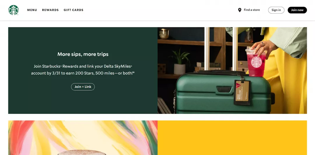
The Starbucks website uses a responsive design to adjust its layout and content for different screen sizes, making it easy to navigate on any device.
That's how it appears on the desktop.
That’s how it appears on mobile.
Also, the Airbnb website uses a responsive design to provide a consistent user experience across desktop and mobile devices, making it easy for travellers to search for and book accommodations on the go.
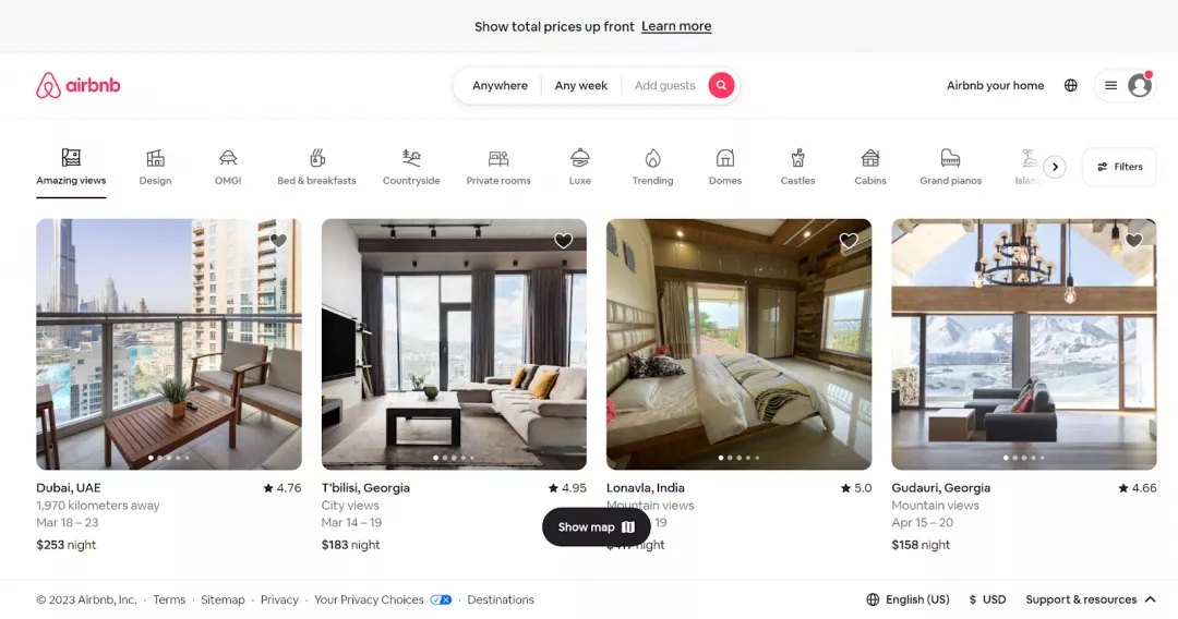
It’s the desktop version.
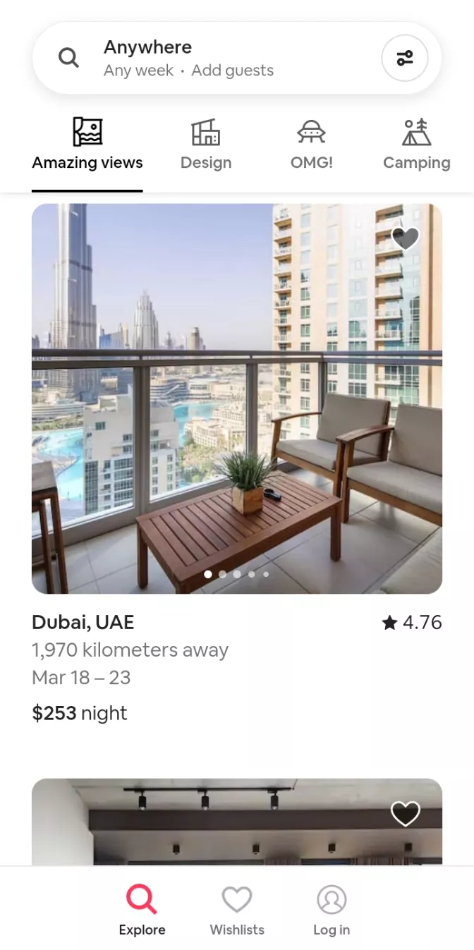
It’s the mobile version.
Why is responsive design important?
Responsive design is important for several reasons:
Mobile usage
People tend to use mobile devices for accessing the internet which makes responsive design a crucial part of designing websites.
With it, users can navigate the websites on small screens without having to carry large-screen devices for internet usage.
Improved user experience
Responsive design makes the user view and visit the website with ease without the need to swipe left or right to view the complete menu or upper part of the page.
This way, users get the best experience while navigating a website and this increases the engagement and conversions further.
SEO benefits
Responsive web design does not require the website to create several URLs or versions of the same page for different devices.
Therefore, SEO issues can be minimized and user experience is enhanced by using responsive design.
Search engines also prefer responsive design which is why the visibility and ranking of the website improve over time.
Google says that responsiveness is crucial to a website's SEO but doesn't officially call it a ranking factor.
Cost-effective
Website owners may spend time and resources on creating multiple URLs for separate pages of the website that do not have responsive design.
Responsive design uses a single codebase which does not require creating and maintaining multiple versions.
Future-proofing
Responsive design ensures that even if the new devices are introduced with new features and functionalities, websites and apps must adapt to these devices.
Without it, designers and developers would have to recreate the website's features and navigation every time a new device is introduced.
History of Responsive Design
Responsive design is not a very new concept as the web designer Ethan Marcotte coined this term in an article for A List Apart.
He suggested that instead of creating multiple versions of a website for different devices, designers should create one flexible design that could adapt to any screen size.
In 2011, the first responsive website was created by the Boston Globe, which received widespread attention and paved the way for other organizations to adopt the approach.
In the following years, responsive design gained popularity as the use of mobile devices increased rapidly.
How responsive web design and adaptive design are different?
Responsive web design and adaptive design are two approaches to designing websites and applications for different devices, and while they share some similarities, there are some key differences between them.
Responsive design involves creating a single design that can adapt and adjust to different screen sizes and device types, using flexible grids, images, and other elements.
This means that the same design can be used on all devices, and the content will adjust automatically to fit the screen size.
Adaptive design, on the other hand, involves creating multiple versions of a website or application, each designed specifically for a different device type or screen size.
When a user visits the website or application, the system detects the device being used and serves up the appropriate version of the site.
One key difference between responsive and adaptive design is that responsive design uses a single codebase, whereas adaptive design requires multiple versions of the site or application to be created.
This can make the responsive design more efficient and easier to maintain over time.
How does responsive design work?
The key technology used in creating responsive design includes HTML, CSS, and JavaScript. HTML provides the basic structure of sites, which is enhanced and modified by CSS. JavaScript, on the other hand, makes a site interactive.
The core principle behind responsive design is using flexible grids and fluid layouts. Instead of defining sizes in pixels which are fixed, sizes are defined in relative units like percentages.
This way, elements on a webpage can resize and adjust based on the size of the screen viewing them.
Another crucial part of responsive design is the use of CSS media queries. Media queries allow developers to apply different styles to different devices based on their characteristics, such as screen size and resolution.
Flexible images and responsive typography are also important. These techniques ensure images and text resize appropriately and don't end up too small or too large on different screens. This keeps the content readable and easy to navigate no matter the device.
Furthermore, developers might use advanced CSS features like Flexbox for better control of the layout and to ensure elements behave predictably when the page layout must accommodate different screen sizes and display devices.
By using a responsive design approach, developers can create websites and applications that provide a seamless user experience across all devices, from desktop computers to mobile phones and tablets.
The foundations of responsive design
The following are the most crucial components to make the foundations of a responsive design.
HTML and CSS: The building blocks of responsive design
HTML and CSS are the foundational elements of web design and are crucial to building responsive websites. HTML provides the structure and content of a web page, while CSS provides visual styling.
Responsive design relies heavily on CSS, as it allows developers to apply different styles based on screen size and other device characteristics.
By separating the content from the presentation, developers can create websites that are optimized for any device.
Fluid layouts: Adapting elements to any screen size
Fluid layouts are indeed a critical component of responsive web design. The main goal of fluid layouts is to ensure that the website or application looks good and functions well on any device, irrespective of the size of the screen.
The principle behind fluid layouts is quite straightforward: instead of using fixed pixel values to determine the size or position of elements on a webpage, developers use percentages.
This relative unit of measure means that an element's size or position will be proportional to the screen size.
For example, suppose a sidebar in a fluid layout is set to be 30% of the width of the screen. This means that the sidebar will always take up 30% of the screen width, regardless of the actual size of the screen.
Whether viewed on a large desktop monitor or a small smartphone screen, the sidebar will adjust to 30% of the screen width, ensuring consistency in the design.
This dynamic resizing is what makes fluid layouts "fluid." Elements can grow and shrink, adjusting based on the screen size, like the liquid in a container. This approach ensures that content remains accessible and easy to read on any device.
Flexbox layout: A more efficient way to create responsive layouts
Flexbox is a CSS layout module that provides a more efficient way to design flexible and responsive layouts.
With Flexbox, developers can easily create layouts that adapt to different screen sizes and device orientations.
Flexbox works by allowing developers to create flexible containers that can adjust their size and position based on the content inside them.
This makes it easier to create complex layouts that are optimized for any device, without the need for complex CSS code.
Responsive images
Images are an important component of web design, but they can be a challenge when it comes to responsive design.
Responsive images use techniques like cropping, resizing, and compression to ensure that images look great on any device.
One approach to responsive images is to use the "srcset" attribute, which allows developers to specify multiple versions of an image and let the browser choose the most appropriate one based on the device's screen size.
An alternative method involves utilizing responsive images, which adjust in size depending on the screen dimensions, while still maintaining their quality.
Media queries
These are key aspects of responsive design, allowing developers to apply custom CSS styles based on the size of the device screen.
Media queries work by detecting the screen size and applying specific styles accordingly.
This allows developers to create custom styles that are optimized for different screen sizes, ensuring that the website or application looks great on any device.
Responsive breakpoints
Responsive breakpoints are predefined screen widths that trigger changes in the layout of a website to accommodate the size of the screen.
These changes may involve altering the font size, changing the layout of elements, or even showing or hiding certain elements entirely.
By using responsive breakpoints, web designers can ensure that their websites are optimized for all screen sizes, from mobile devices to desktop computers.
Some common responsive breakpoints include
320px: This is the width of many mobile devices in portrait modes, such as iPhones and Android phones.
480px: This is the width of many mobile devices in landscape mode, such as some larger smartphones and small tablets.
768px: This is the width of many tablets in portrait mode, such as the iPad.
992px: This is the width of many laptops and desktops, and is often used as the default breakpoint for desktop designs.
1200px: This is a common maximum width for desktop designs, and may be used as a breakpoint for larger screens.
Can I check whether my website is responsive or not?
To check whether your website is responsive or not, you can use a variety of methods.
Use Google's Mobile-Friendly Test
Go to Google's Mobile-Friendly Test page and enter your website's URL. The tool will analyze your website and provide a report on its mobile-friendliness.
Use Responsinator
Go to the Responsinator website and enter your website's URL. The tool will show you how your website looks on different devices and screen sizes.
Manually test
Open your website in a browser and resize the browser window to different sizes to see how the content and layout adjust. This will give you a general idea of how your website behaves on different devices.
Use browser developer tools
Most modern browsers come with developer tools eg. Chrome Devtools that allow you to simulate different devices and screen sizes. Use these tools to test your website's responsiveness and behaviour on different devices.
How to create a responsive website?
Creating a responsive website involves several steps. Below is a guide to creating a responsive website:
Planning
Before you begin designing your website, you need to have a clear plan of what you want to achieve. Identify your target audience, the purpose of the website, the type of content you will include, and the functionality you will need.
Wireframing
After you have made a plan, the next step is to design a basic structure of your website by using wireframing tools.
Wireframes serve as a blueprint for your website, enabling you to picture the placement of content and the overall layout. They also help you to spot potential design issues early on in the process.
Layout and styling
Designing and styling your website so that it can adjust to different screen sizes and resolutions is the most crucial step. You will have to consider different components and tasks while carrying out this step.
Frameworks for creating responsive websites
You can find many frameworks for responsive designs. Here are two of the most common frameworks.
W3.CSS:
W3.CSS is a CSS framework developed by the World Wide Web Consortium (W3C), the organization responsible for creating web standards.
The W3.CSS framework provides a set of styles and components that can be used to create responsive websites quickly and easily.
Some of the features of the W3.CSS framework include
A responsive grid system that adjusts based on screen size
Pre-built styles for typography, forms, tables, and more
Support for CSS animations and transitions
Lightweight and fast-loading code
Compatibility with all modern browsers
Bootstrap:
Bootstrap is a popular CSS framework developed by Twitter. It provides a set of pre-built components and styles that can be used to create responsive websites quickly and easily.
One advantage of using the Bootstrap framework is its popularity and large community of developers, which means that there are many resources available for troubleshooting and customization.
Some of the features of the Bootstrap framework include
A responsive grid system that adjusts based on screen size
Pre-built styles for typography, forms, buttons, navigation, and more
Support for CSS animations and transitions
JavaScript plugins for common functionality, such as carousels and modals
Customizable themes and templates
Using Flexbox
Flexbox is a CSS layout model that makes it easy to design flexible, responsive layouts.
It operates by establishing a flex container that holds flex items and then utilizing a variety of CSS properties to manage the layout and alignment of these items.
In a flexbox layout, you define a parent element as a flex container, and its child elements become flex items.
This arrangement allows you to easily manipulate the alignment, direction, order, and size of these items.
For example, with Flexbox, you can choose whether items stack vertically or horizontally, how they distribute space along that axis, how they align with respect to each other and the container, and more.
This control makes it incredibly convenient to create complex layouts and designs that also respond gracefully to different screen sizes.
Note: As a Search Engine Optimization specialist, it's enough for you to grasp the fundamental concept of responsive design. If you need to create a responsive design, you can always collaborate with a designer or developer to get the job done.
Setting the Viewport
One important step in creating a responsive website is setting the viewport. The viewport is the visible area of a web page displayed on a device's screen.
By setting the viewport meta tag in the head section of your HTML code, you can ensure that your website scales appropriately for different screen sizes.
Here is an example of how to set the viewport:
<meta name="viewport" content="width=device-width, initial-scale=1.0">This code sets the viewport to the width of the device's screen and sets the initial scale to 1.0. By using this code, you can ensure that your website displays properly on all devices, from desktops to mobile phones.
Using the width property
Another important step in creating a responsive website is by using the width property in your CSS code.
By setting the width property to a percentage instead of a fixed pixel value, you can ensure that your website scales appropriately for different screen sizes.
Here is an example of how to use the width property:
img {

width: 100%;

max-width: 600px;

}
In this example, the width of the image is set to 100% of the parent container's width. This means that the image will scale up or down depending on the screen size.
Additionally, the max-width property is set to 600px, which means that the image will not exceed 600px in width even on larger screens.
By using the width property, you can create a website that looks great on all devices.
Showing different images according to browser width
One important aspect of creating a responsive website is optimizing images for different screen sizes.
One way to do this is by showing different images depending on the browser width using the HTML <picture> element and the <source> element.
Here is an example of how to use the <picture> element:
<picture>

<source media="(min-width: 768px)" srcset="large-image.jpg">

<source media="(min-width: 320px)" srcset="medium-image.jpg">

<img src="small-image.jpg" alt="Responsive Image">

</picture>
In this example, three images are included:
Small-image.jpg
Medium-image.jpg
Large-image.jpg
The <picture> element includes the <source> elements, which specify the image source and media queries that determine when the image is displayed.
The first <source> element specifies that the large-image.jpg is displayed on screens wider than 768px, the second <source> element specifies that the medium-image.jpg is displayed on screens wider than 320px, and the <img> element specifies that the small-image.jpg is displayed on screens narrower than 320px.
By using the <picture> element, you can ensure that the appropriate image is displayed based on the browser width, which can help optimize your website's performance and user experience.
Responsive text size
In addition to images, it's also important to ensure that your website's text is responsive and adjusts to different screen sizes.
One way to do this is by using the CSS vw unit, which stands for “viewport width”. The vw unit specifies the size of an element as a percentage of the viewport width.
Here is an example of how to use the vw unit for responsive text size:
h1 {

font-size: 4vw;

}
In this example, the font size of the <h1> element is set to 4vw. This means that the font size will adjust proportionally to the viewport width.
For example, on a screen with a width of 800px, the font size will be 32px (4% of 800px). On a screen with a width of 400px, the font size will be 16px (4% of 400px).
By using the vw unit for font sizes, you can create a website that adjusts the text size based on the screen size, which can help improve the user experience and readability of your content.
Testing
It is an essential part of the development process that helps to ensure that the website provides a positive user experience across a range of devices and screen sizes.
One way to test responsive web design is to use device emulation tools, which simulate different screen sizes and resolutions. These tools allow developers to preview how their website will look on various devices.
Some of the most common tools are
Responsinator
Chrome Device Mode
BrowserStack
CrossBrowserTesting
Launching
Once you have tested your website, you can launch it. Choose a web hosting provider and upload your files to the server.
Make sure your website is optimized for search engines and includes essential features like Google Analytics.
Maintenance
After launching your website, make sure to keep it updated and maintained regularly. Regularly check for broken links, optimize images, and update content. Consider implementing a content management system like WordPress to make updates easier.
Conclusion
Responsive web design is the most basic part of web design in this day and age. With more and more people using mobile devices to use the internet, this approach to web design is essential to provide the best user experience.
To create engaging and easily navigable websites, web designers and developers must be aware of the trends and techniques in responsive design to create the best for the users.