

What is website navigation?
Website navigation is an organized list of links to other pages on the same website.
Navigation allows people to easily move around and explore the whole site. It organizes how to get from one page to another.
Having good navigation is important because it makes the website easy to use. When navigation is clear and simple, visitors can quickly find what they are looking for.
It also helps search engines like Google understand the website better.
What is the navigation menu?

The navigation menu is a category or item list that tells you the direction or path to reach a desired web page.
Depending on the website's design, it can appear on the page's top, bottom, or one side. Sometimes, it is hidden, and one needs to click an icon to explore other categories or items.
For instance, a drop-down menu might have “More” written on it that you click on to open another list of items.
Why is website navigation important to SEO?
Website navigation is important to SEO for the following reasons.
User experience
User experience is the first thing to consider while designing a website’s navigation structure. On a website, many pages answer several queries or sell products.
The navigation menu and its structure tell the user which page to go on. User experience will be better if the user has to make just a few clicks to reach a page.
On the other hand, if the structure is so complex that a user cannot navigate properly to reach the information they want, it will be bad for the user and the website’s SEO.
Crawling
Like a user, an appropriate navigation structure is also good for a crawler to crawl properly and index the web pages. The crawling process largely depends on the interconnectivity of links, and Google’s crawler will find pages faster when there are many links.
Google encourages the linking of major categories with subcategories and sub-categories with product pages to increase the efficiency of the crawler.
Moreover, more links tell the crawler that a page is more important than others, and it will improve your website’s optimization.
Link equity
Link equity, also known as link juice, is the value that a page passes to another page with which it links. It is a kind of vote for the content quality of the page.
More links to a web page mean more pages have voted for this page.
If you make sure that the most important and quality pages get more internal links, it will increase the link equity of those pages.
Conversion rate
If a website’s navigation is easy and beneficial for the user, they are more likely to respond to calls to action and complete desired actions.
For example, if you have an e-commerce website and you are selling a lot of products. The more responses to calls to action you get, the more conversion rates your website will have.
In simple terms, a conversion is when a visitor clicks the “buy now” button—which means they have made a buying decision on your website.
Types of website navigation
In terms of how and where the navigation menu appears on the website - there are the following main types of website navigation
Header navigation bar
It is the topmost horizontally listed menu. It usually, but not always contains the options like “About”, “Pricing”, or “Log In”. In addition to these options, it usually consists of the most important pages of the website.

Footer menu
It is located at the bottom of the page, which you can reach upon scrolling down. Footer menus are mostly detailed ones as they contain more options than the head bar does.

Sidebar menu
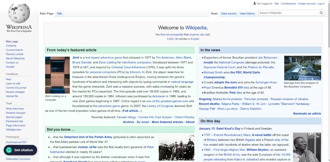
The sidebar menu is the vertical menu you can see on many websites. It can either appear on the left or right side of the page.
Wikipedia has it on the left side:
Drop-down menu
A drop-down menu may contain another list of web pages. An example of it can be a “More” option with a small arrow pointing down. Upon clicking on “More” or the arrow, you will see another list.
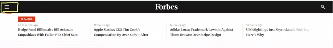
Hamburger menu
The hamburger menu is mostly designed for mobile navigation. It is a hidden and expandable menu which is represented by three stacked horizontal lines.
In terms of functionality - website navigation can be divided into the following categories:
Global/main navigation
The global or main menu is the nowadays widely used menu on large websites. Usually, it appears as the horizontal bar menu, and it will remain the same as a horizontal bar menu on every page.
For instance, Dawn newspaper’s website has a main menu that remains identical on every page you go on.

Hierarchical navigation
This type of navigation goes from general to specific. It will connect the main categories to the sub-categories and follow this sequence until it reaches a specific product/category page.
For example, on an e-commerce website, you start the search from the “Electronics” page (general category), and the last point you reach displays “iPhone 14” (product page). Likewise, the categories are also interlinked within the entire website.
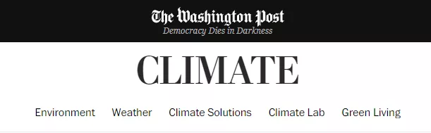
Another feature of this navigation is that it does not always show the horizontal bar menu as global navigation does.
For example, if you go into the “Climate” section on The Washington Post, you will not see the header bar menu; instead, you will find the subcategories of the section below the “Climate” heading.
Local navigation
Local navigation refers to the navigation within a specific set of pages that are interconnected through hyperlinks (internal links).
Users can navigate locally by clicking on the linked text, which allows them to explore more information about a particular topic or category.
A prime example of local navigation can be found on Wikipedia. In this context, a single page often contains numerous hyperlinks directing users to relevant pages or topics, enabling them to easily explore and discover more information within the site's vast array of interconnected pages.
Best practices for website navigation
Some practices can make your website navigation better.
Ease of use
While thinking about website navigation, the first thing to consider should be the user experience. Easy navigation with a simple design will make the website more usable for the visitor.
There is no such rule as three clicks- the user should find the desired page in three clicks. Nothing depends on clicks; only a clear, concise, and navigable path is necessary.
Here’s an example of a jewellery brand, “Tiffany & Co.” that encourages users to find the product of their choice without much scrolling or clicking.

Visibility
At times, to make a website aesthetically appealing, designers do not focus more on usability. In doing so, they make it difficult for the user to find the menu, resulting in a bad usability and user experience.
This website uses a hamburger menu in the top right corner, and none of the links is available for navigation.
At times, the website, like the one below, is so cluttered with several links that it creates the issue of visibility.
When the layout is overcrowded, users may struggle to find the information they are looking for, leading to a frustrating experience.
Blogs and product interlinking
Usually, blog posts are linked with product pages because blog posts advertise a product and are a good way to attract customers.
More often, the product pages do not link back to blog post pages which is an important part of internal linking. Doing so can be the best strategy for your SEO.
Tracking
Many website owners use URL tracking to monitor how users interact with their sites. URL tracking parameters are extra characters added to a webpage's address when someone clicks on it.
While these parameters don't change the actual page content, they can create issues with duplicate content appearing on the same page.
To avoid these duplicate content problems, there are alternative tracking methods:
Use Google Analytics event tracking: This tracks user interactions without changing the URL address.
Use JavaScript onClick: This is code that performs tracking without duplicating the page.
Use a self-referencing canonical tag: This tag tells search engines which version of a page is the original, unique one to prevent duplication.
Priority menu
The menu at the very top of a website is the main place users look. You should include all the most important links in this top menu.
Users may not scroll all the way down to the bottom menu to find a link they need.
For example, SEODebate has all the key links in its top menu. This makes navigation easy for users.

Usable on every device
It's important to optimize your website's menus so they work well on every device - desktops, tablets, and mobile phones. Menus designed just for desktop viewing may not work properly on smaller mobile screens.
The goal is to make sure the menu is easy to use and navigate, whether someone is on a computer or a mobile device. You want a consistent, seamless experience for all users.
For mobile devices, one good solution is using a hamburger menu.
The hamburger menu allows mobile users to easily access the menu options without the links taking up too much space on the small screen.
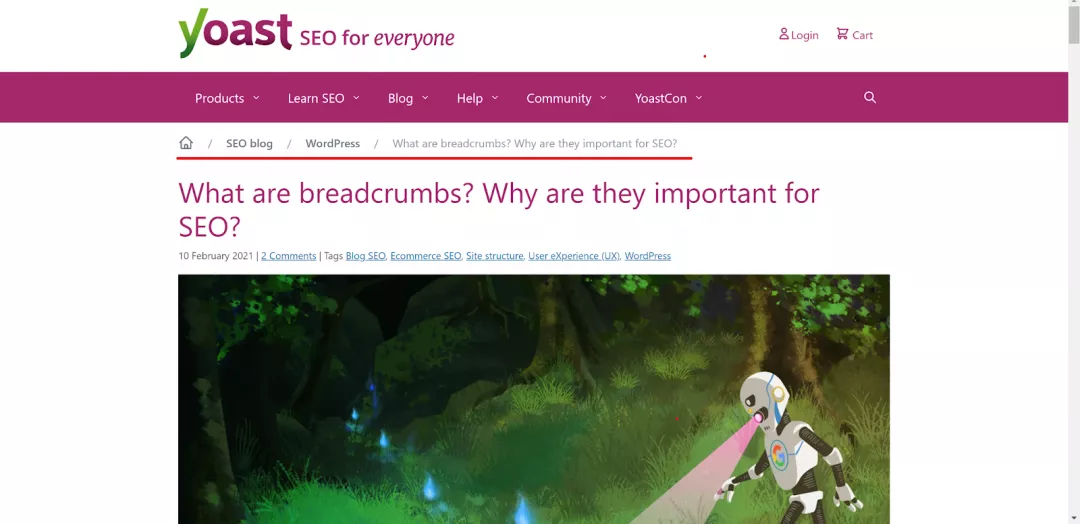
Adding breadcrumbs
Adding a breadcrumbs menu can help a user know the path they have come from. This menu shows the current page along with the connected pages behind it.
Yoast.com uses a breadcrumbs menu like this:
Conclusion
Website navigation is very important for search engine optimization (SEO). When designing a site's navigation, you need to consider two key things:
The user experience
How search engines evaluate the navigation
In other words, the navigation needs to work well for both human users and search engines.
While having an attractive, visually appealing navigation can initially draw in users, making it too pretty at the expense of usability can hurt your SEO efforts.