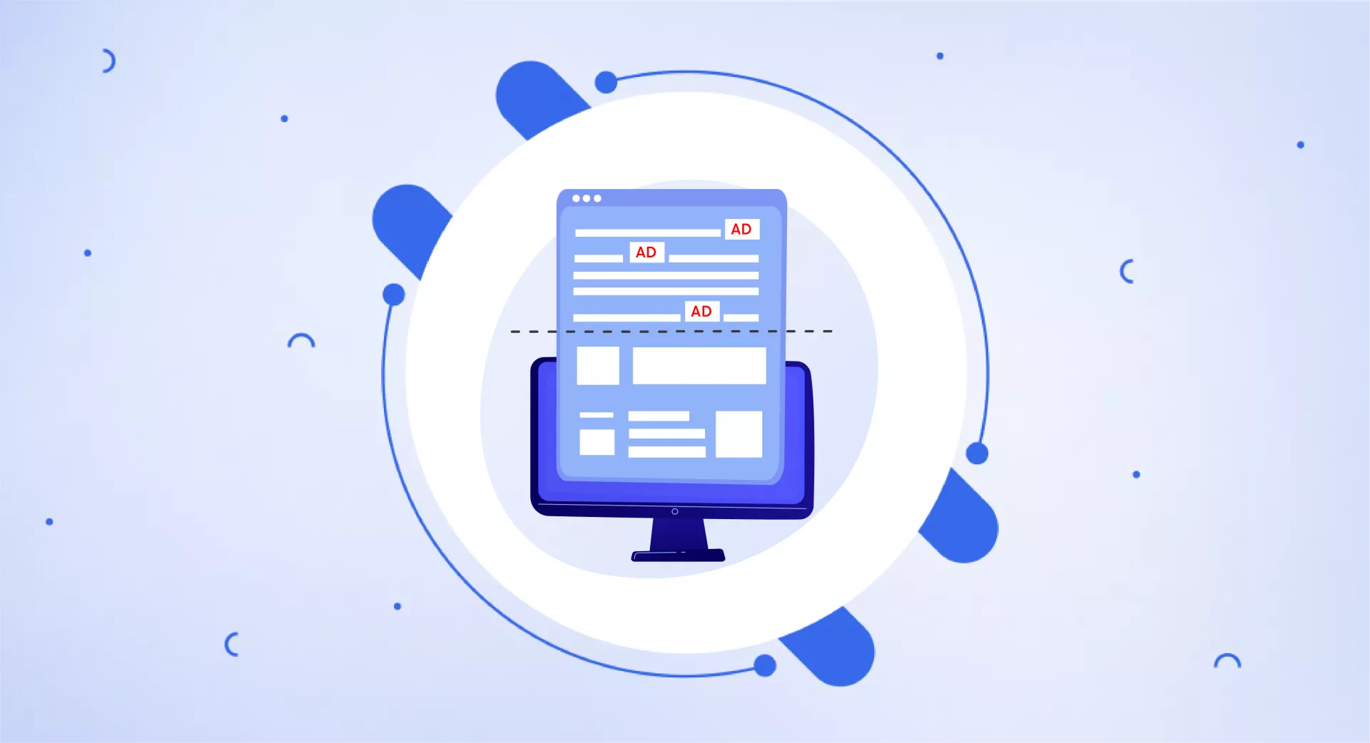
What is Top Heavy?
The term "top-heavy" means a website has way too many ads stuffed into the top area – the part you can see without scrolling down.
With so many extras at the top, it makes it hard for users to quickly find and see the actual main content or information they came to the website for. It creates a messy, confusing-looking page.
Why Being Top Heavy is Bad
A top-heavy layout gives a poor experience because it buries the core content behind promotions, banners, and other unrelated stuff. This frustrates users who have to dig through extras just to get to what they really want.
Not only is it annoying for users, but search engines like Google also don't like top-heavy pages. In fact, Google has updated how it lowers rankings for websites that are too top-heavy with ads and clutter.

Having a Better Layout
To avoid being top-heavy, websites should have a nice balanced layout that puts the main content front and centre when users first arrive.
Ads, sign-up boxes, and other extra things should be neatly organized on the sides or in other areas out of the way.
The goal is for users to be able to immediately see and access the main content they were looking for, without a bunch of extras getting in the way first.
Keeping things simple creates a better experience.
The Main Point
While ads and promotions are necessary, having too much at the very top is bad. A top-heavy page frustrates users and can even hurt search rankings.
Websites should have a balanced, content-focused design that allows visitors to quickly find information. With a cleaner layout putting users first, more people will stay engaged on the site.


